
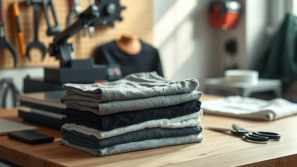
Walk into any print shop that runs a lot of DTF and you will hear the same complaint sooner or later: the transfer looked perfect on the press, then the customer came back two weeks later with a cracked graphic. Most of the time the press settings were fine. The problem was the blank. Fabric weight, weave, dye content, and shrinkage all decide how a DTF film bonds, and picking the wrong shaka wear style for a job is one of the quietest ways to lose a repeat customer.
This guide is about matching blanks to transfers on purpose instead of grabbing whatever is stacked nearest the heat press. You will find concrete comparisons, a few workflow habits worth adopting, and the questions to ask before you commit a full gangsheet to a fabric you have not tested.
Why the blank matters as much as the transfer
A DTF transfer is a layer of pigment ink bonded to a thermoplastic adhesive film. When you press it, that adhesive melts into the surface of the garment. On a tight, smooth cotton jersey it sinks in evenly and locks down. On a loose knit, a heavy fleece, or a garment with a silicone wash, the adhesive has less surface to grab and more movement to survive. That is the whole story behind most peeling and cracking complaints.
Shaka Wear blanks sit in a useful middle ground for DTF work. The cotton is dense enough to hold detail, the surface is consistent from piece to piece, and the weight range covers everything from lightweight retail tees to heavyweight streetwear staples. The catch is that those different weights do not all want the same press routine, which is exactly where shops get into trouble.
Matching fabric weight to the design you are printing
Before you think about price per unit, think about ink coverage. A small left-chest logo and a full back panel with gradients and fine linework put very different demands on a blank.
Lightweight cotton for detail-heavy art
Lighter jersey knits tend to have a smoother face, and that smoothness is what lets fine halftones and thin outlines stay crisp after pressing. If a customer sends artwork with small text, portrait shading, or thin script, a lighter blank usually gives you a cleaner result. The tradeoff is that very light fabric can show adhesive texture through the print if you overpress, so keep your pressure moderate and trust the dwell time.
Midweight as the everyday default
Most shops end up standardizing on a midweight tee for the bulk of their DTF output, and for good reason. It holds a print well, drapes like something a customer actually wants to wear, and survives normal washing without special handling instructions. When you are building a DTF Gangsheet Builder layout for a mixed order, midweight blanks are the safest bet for anything you have not specifically tested.
Heavyweight for large, bold graphics
Heavy cotton has a thicker hand and a slightly more textured surface. Large solid-color graphics and blocky type handle this well because there is plenty of ink-to-fabric contact. What you want to avoid is pressing very fine detail onto a heavy, textured knit without a test piece, since the texture can interrupt the adhesive bond across the design. A quick press-and-wash test on one garment saves you a whole run of returns.
Color choice and how it changes your print
DTF is famous for printing on dark garments without a white underbase step, and that flexibility is real. But the color of the blank still affects the final look in ways worth planning for.
- White and light heathers: the most forgiving option. Colors read true, whites stay clean, and you get the widest margin for error on press pressure.
- Black and deep navy: excellent for bright graphics, but any stray adhesive residue around the edges of the transfer shows up immediately. Trim your films tight and check edges before pressing.
- Heather greys and blends: the fabric texture shows through lighter ink areas. That can look great on vintage-style designs and less great on flat corporate logos.
- Brights and neons: test before you commit. Some dyed fabrics release color under heat, and a white graphic on a saturated red or turquoise blank is the classic place to find out.
Planning a gangsheet around your blank inventory
Here is a habit that pays off fast: build gangsheets around the blanks you actually have on the shelf, not the other way around. If you are short on midweight black tees and long on white, your sheet layout should reflect that before you start nesting artwork.
A DTF Gangsheet Builder makes this easier because you can see the full layout before you commit film. Group designs by garment color and size run, leave a little breathing room between transfers for clean trimming, and keep a consistent margin so your cutter or scissors have room to work. Shops that plan sheets this way waste noticeably less film per order, and the savings compound across a month of production.
Size runs, shrinkage, and the fit question
Customers notice fit before they notice print quality. If a blank shrinks a full size after the first wash, the shirt feels wrong no matter how good the graphic looks. Cotton blanks generally shrink somewhat, and heavyweight cotton can move a little more than lightweight jersey. Order a sample in each weight you plan to stock, wash it the way a customer would, and measure it. Then size your gangsheet placements against the post-wash dimensions rather than the factory spec.
This matters most on placement-sensitive designs: a back print that sits too high after shrinkage, or a chest logo that drifts toward the collar. Measure once, adjust your templates, and you stop fielding those complaints entirely.
Press settings that respect the fabric
There is no single correct setting for every Shaka Wear blank, but a few principles hold across the range. Use enough pressure that you can see the fabric weave through the film, not so much that you flatten the knit. Peel cool for a matte, soft finish, or hot for a slightly glossier bond, and stay consistent within a single order so every piece matches.
Always press a scrap of the actual garment before running a full sheet. Fabric finishes vary between dye lots, and a two-minute test on a cutoff sleeve is cheaper than reprinting an entire order.
Questions print shops ask before switching blanks
Which Shaka Wear style works best for a first DTF test?
Start with a midweight cotton tee in white. It is the most forgiving combination of smooth surface, neutral color, and predictable shrinkage, so any issue you see is almost certainly a press or film problem rather than the garment.
Can I print DTF on heavyweight Shaka Wear tees without special handling?
Yes, but test first. Heavy cotton has a more textured face, so use a slightly longer dwell time and check that fine details bonded fully before you run the rest of the order.
How do I stop DTF prints from cracking on darker blanks?
Cracking on dark garments usually comes from uneven pressure or under-cured adhesive rather than the color itself. Trim films close to the design, press with firm even pressure, and peel according to your film instructions.
Should I build separate gangsheets for different garment colors?
It helps. Grouping by color keeps your press routine consistent and reduces the chance of mixing up transfers during a busy run, especially when several orders ship the same week.
How much should I budget for test blanks?
Enough to cover one garment in each weight and color you plan to stock. Treat it as a production cost, not an extra, because one avoided reprint pays for the samples.